Module 2 • Lesson 2📈 Curves: Precise Tone & Color
If you learn one advanced control in all of Photoshop, make it Curves. It's a single graph that can brighten, darken, add contrast, and color-grade — and everything else (Brightness/Contrast, Levels) is just a simpler version of it. Intimidating at first glance; a friend for life once it clicks.
📚 What You'll Learn
By the end of this lesson, you will be able to:
- Read the Curves graph: input across, output up, the diagonal is "no change"
- Add contrast with a classic S-curve, and flatten it for a soft, filmic look
- Color-grade by bending the Red, Green & Blue channels
- Spiral back to masks: apply a Curves adjustment layer to only part of the photo
⏱️ Estimated Time: 55 minutes
🎯 Project: Give your developed photo a finished contrast look, then grade one region (like a sky or a subject) separately with a masked Curves layer.
In This Lesson
✨ The Goal: Shape the Light
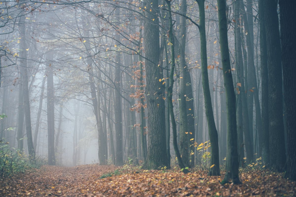
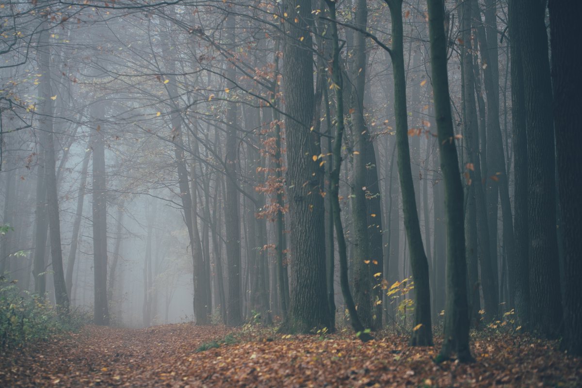
Same developed photo, two tone treatments. The right side is flat; the left has a gentle S-curve giving it depth and pop. One graph, that much difference:
🧠 Mental Model: A Tone Translator
A curve is a translator for brightness. Every tone in your photo walks in on the horizontal axis (its input brightness) and walks out on the vertical axis (its output brightness). The line is the rulebook for the translation.
Start with a perfectly diagonal line: every tone leaves exactly as it came in: no change. Bend a point up and those tones get brighter; bend it down and they get darker. Because you choose which tones to bend (shadows, midtones, or highlights), a curve gives you surgical control that a single brightness slider never could.
🧠 Why "add the word yet" applies here
Curves scares people because it's a graph, and graphs feel like math class. It isn't. It's a picture of "make these tones brighter, those darker." If it looks confusing right now, add yet — after three S-curves it becomes the most intuitive tool you own.
🔍 Reading the Curve
Here's the graph itself. The dashed diagonal is the "no change" baseline; the blue line is a classic S-curve, with shadows pulled down and highlights lifted up:
| Curve shape | Effect | Use for |
|---|---|---|
| Point up in the middle | Brighter overall | A dark photo |
| Point down in the middle | Darker overall | An overexposed photo |
| S-curve | More contrast & punch | A flat, hazy photo |
| Inverted / flattened S | Softer, faded, filmic | A moody, low-contrast look |
| Lift the bottom-left corner | "Milky" faded blacks | Matte / vintage grades |
And the Curves panel you'll actually use, a labeled diagram rather than a live screenshot:
🛠️ Guided Build: Contrast & Color
Open grade-working.psd, the developed photo from Lesson 2.1 (or any photo that could use more life).
Step 1: Add a Curves adjustment layer · 2 min
- In the Layers panel click ◐ ▸ Curves. (An adjustment layer. Remember, it comes with a mask.)
- You'll see the graph and your photo's histogram behind it.
Step 2: Build an S-curve · 6 min
- Click a point about a quarter of the way up the line (the shadows) and drag it gently down.
- Click a point about three-quarters up (the highlights) and drag it gently up.
- That's an S. The steeper you make the middle, the more contrast. Keep it subtle: small moves, big results.
⚠️ Protect skin and skies
Aggressive S-curves can make skin blotchy and skies banded. If a region suffers, that's your cue for the masked, local approach in Step 4.
Step 3: Color-grade with a channel · 6 min
- Change the channel dropdown from RGB to Blue.
- Lift the shadow end slightly to push cool blue into the darks; drop the highlight end slightly to add warm yellow to the lights. That cool-shadows, warm-highlights split is the backbone of the cinematic "teal & orange" look. On its own, the Blue channel gives you blue/yellow; for a truer teal, also switch to Red and pull its shadow end down slightly (less red = more cyan).
- Try the Red and Green channels too, in tiny amounts.
Step 4: Grade one region only (spiral back to masks) · 8 min
- Add a second Curves layer and brighten it noticeably.
- Click its mask, fill it black (Alt/⌥ + Backspace with black), then paint white over just your subject (or the foreground) with a soft brush.
- Now only that region gets the brightening: a subtle spotlight. This is dodging with Curves, and it's exactly the mask skill from Lesson 1.1, reused at a higher level.
- File ▸ Save (Ctrl/⌘ + S) your
grade-working.psd. Lesson 2.3 finishes this same file.
✅ You just combined two modules
Global tone (this lesson) + a local mask (Module 1) is the core loop of nearly every professional grade. Everything else is variations on it.
✅ Project Completion Checklist
- ☐ A Curves layer adds contrast with a subtle S-curve
- ☐ I nudged at least one color channel (Red/Green/Blue) for a grade
- ☐ A second, masked Curves layer grades only one region
- ☐ Nothing looks blotchy or banded at normal viewing size
- ☐ Every edit is a re-editable adjustment layer
- ☐ I saved the .psd for Lesson 2.3
🧗 Now You: Solo Variation
🌟 Your challenge
- Grade the same photo three ways with Curves only: punchy (strong S), filmic (lifted blacks, gentle S), and moody (darker mids, cool shadows).
- Save each as a JPEG and line them up. Which is "you"? That's your style forming.
- On one, add a masked Curves layer that darkens the edges of the frame, a subtle vignette that pulls the eye inward.
Going further: click the little on-image adjustment icon (the pointing hand) to turn it on, then drag up or down directly on a tone in your photo. Photoshop moves the matching point on the curve for you.
🍳 Recipe Card: The S-Curve
Contrast & color in one panel
- ◐ ▸ Curves adjustment layer
- Shadows point down, highlights point up = S-curve (contrast)
- Channel Blue: shadows up (cool) + highlights down (warm); add Red shadows down for true teal
- Second Curves layer + black mask → paint white to grade one region → File ▸ Save
Mantra: input across, output up; the diagonal is "leave it alone."
📓 Learning Journal
Add to your journal after this lesson:
- Key concepts you learned
- Techniques that clicked for you
- Questions or confusion points to revisit
- Ideas you want to try
- Your progress and feelings about learning this
✍️ This lesson's prompt: Did Curves feel like math or like a dimmer switch by the end? Describe the S-curve to yourself in one plain sentence — that sentence is proof it clicked.
📝 Lesson Summary
🎓 Key Takeaways
- A curve translates input brightness → output brightness; the diagonal means "no change."
- An S-curve adds contrast; a flattened/lifted curve gives a soft, filmic look.
- Switch to the Red/Green/Blue channel to color-grade (e.g. cool shadows, warm highlights).
- A masked Curves adjustment layer grades a single region: Module 1 masks, leveled up.
🎉 What You've Accomplished
You just tamed the tool that intimidates more beginners than any other, and discovered it's really a friendly picture of "brighter here, darker there." Contrast, color grading, and local dodging & burning all live in this one panel now.
❓ Common Questions at This Stage
Curves vs. Levels: do I need both?
Curves does everything Levels does and much more. Levels is a fine quick tool for setting black/white points, but once Curves clicks you'll rarely reach for anything else.
My colors went crazy when I dragged a channel.
Channel curves are potent: move them in tiny amounts. A few pixels of drag on the Blue channel is a strong grade. If it's wild, you've moved too far.
Should Curves go above or below my Camera Raw develop?
Above. Develop globally in Camera Raw first (the base), then stack Curves adjustment layers on top for contrast, color, and local grading. Global before local, again.
🔭 Looking Ahead
You've now got Camera Raw and Curves stacking up as non-destructive layers. In Lesson 2.3 — Smart Objects & Finishing the Grade (the Module 2 finale), you'll learn Smart Objects in depth, apply a Smart Filter, and assemble everything into a finished, fully re-editable graded image.
✅ Before the Next Lesson
- Make five S-curves on five photos until the shape is muscle memory.
- Do one teal-and-orange grade using the Blue and Red channels.
- Write your Learning Journal entry.
📚 Additional Resources
🌟 Encouragement for the Journey
Curves is a rite of passage. Plenty of editors never get comfortable with it — you just did. From here on, "how do I get that look?" almost always has a Curves answer, and now you can find it.